Both styles depend on consistent proportions. Once your guidelines are right, your letters will look more professional immediately.
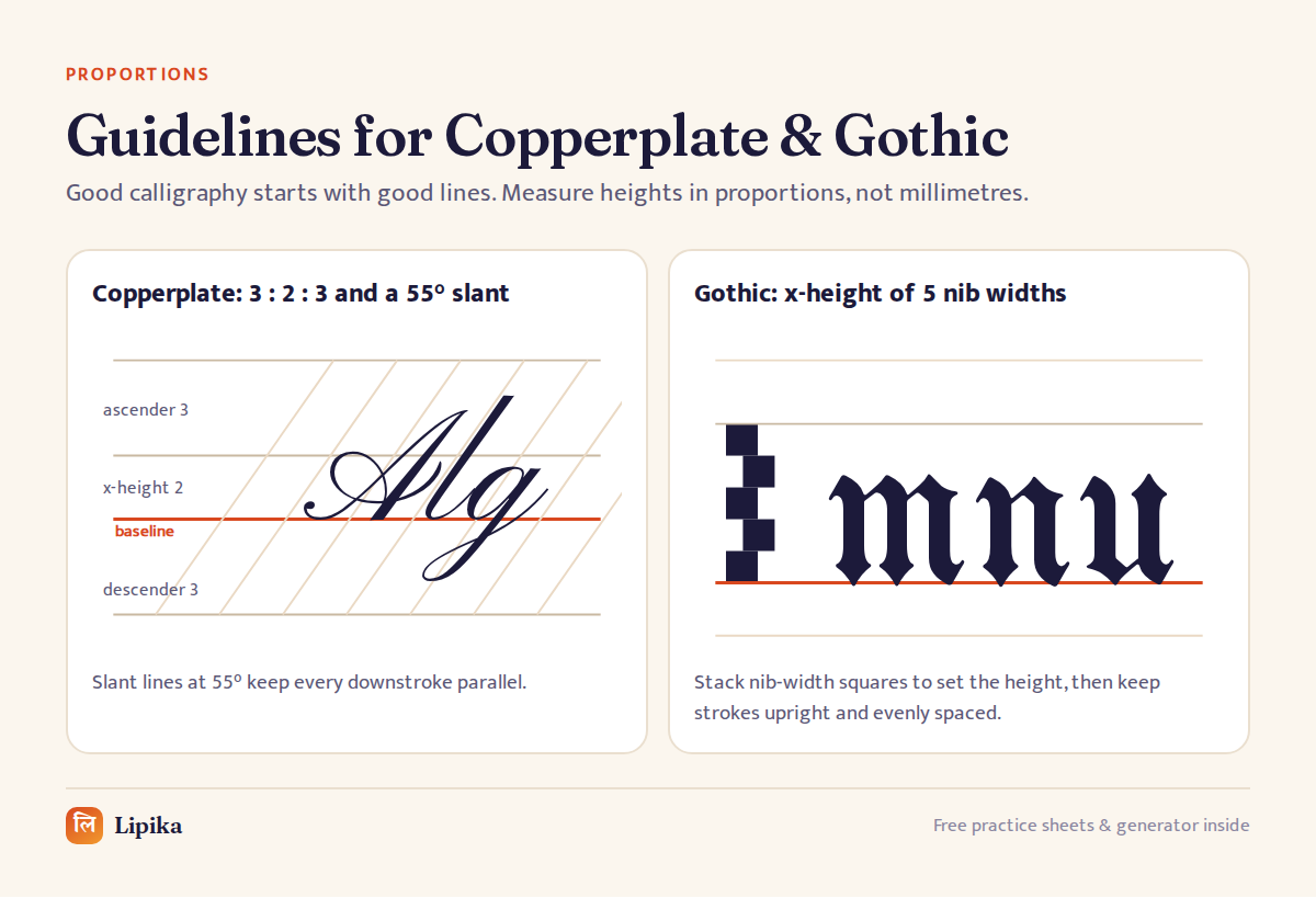
Copperplate (pointed pen)
- Ratio 3 : 2 : 3 for ascender, x-height and descender.
- A 55° slant from the baseline keeps downstrokes parallel.
- Pressure creates the swell; upstrokes stay hairline thin.
- An oblique pen holder helps right-handers keep the nib aligned with the slant.
Gothic / Blackletter (broad-edge pen)
- Set the x-height at about five nib widths, stacked as small squares in the margin.
- Hold the nib at roughly 35–40° and keep strokes upright.
- Space the vertical strokes as evenly as the white space inside letters.
- Ascenders and descenders are short, about two nib widths.
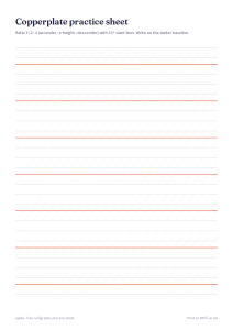
Copperplate practice sheet (3:2:3, 55° slant)
Free A4 PDF. Print at 100% and practise with a pencil first.
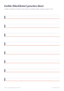
Gothic (blackletter) practice sheet
Free A4 PDF. Print at 100% and practise with a pencil first.
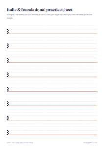
Italic & foundational practice sheet
Free A4 PDF. Print at 100% and practise with a pencil first.
Keep going
Download all free practice sheets, or turn your words into calligraphy right now in the free generator.